Kunde / Client:
Bulling GmbH
Pforzheim
Jahr / Year:
2012 ~
Bereiche / Fields of activity:
Business Consultancy
Re-Branding / CI+CD
Webdesign
Print & Online Communication
Text & Editorial
Web:
www.bulling.de

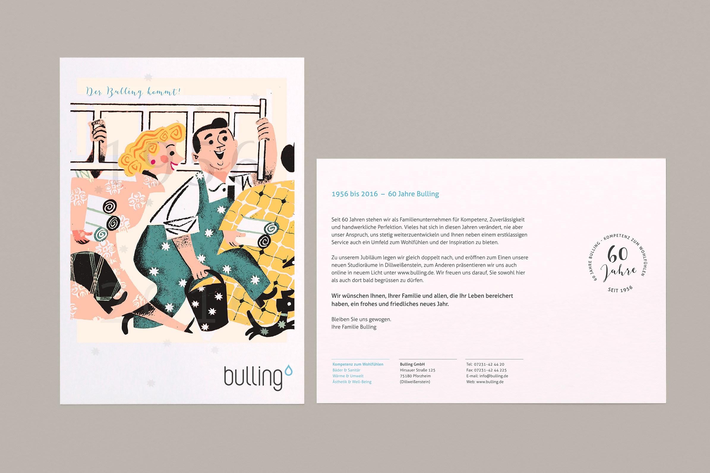
> This specialist for bathroom modernization didn’t feel properly represented by their corporate design anymore. The family business in the second generation underwent a development from a classical local crafts business focusing on sanitary and heating installations towards a design-orientated full-service provider over the last two decades.
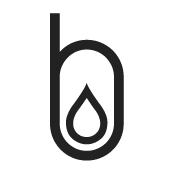
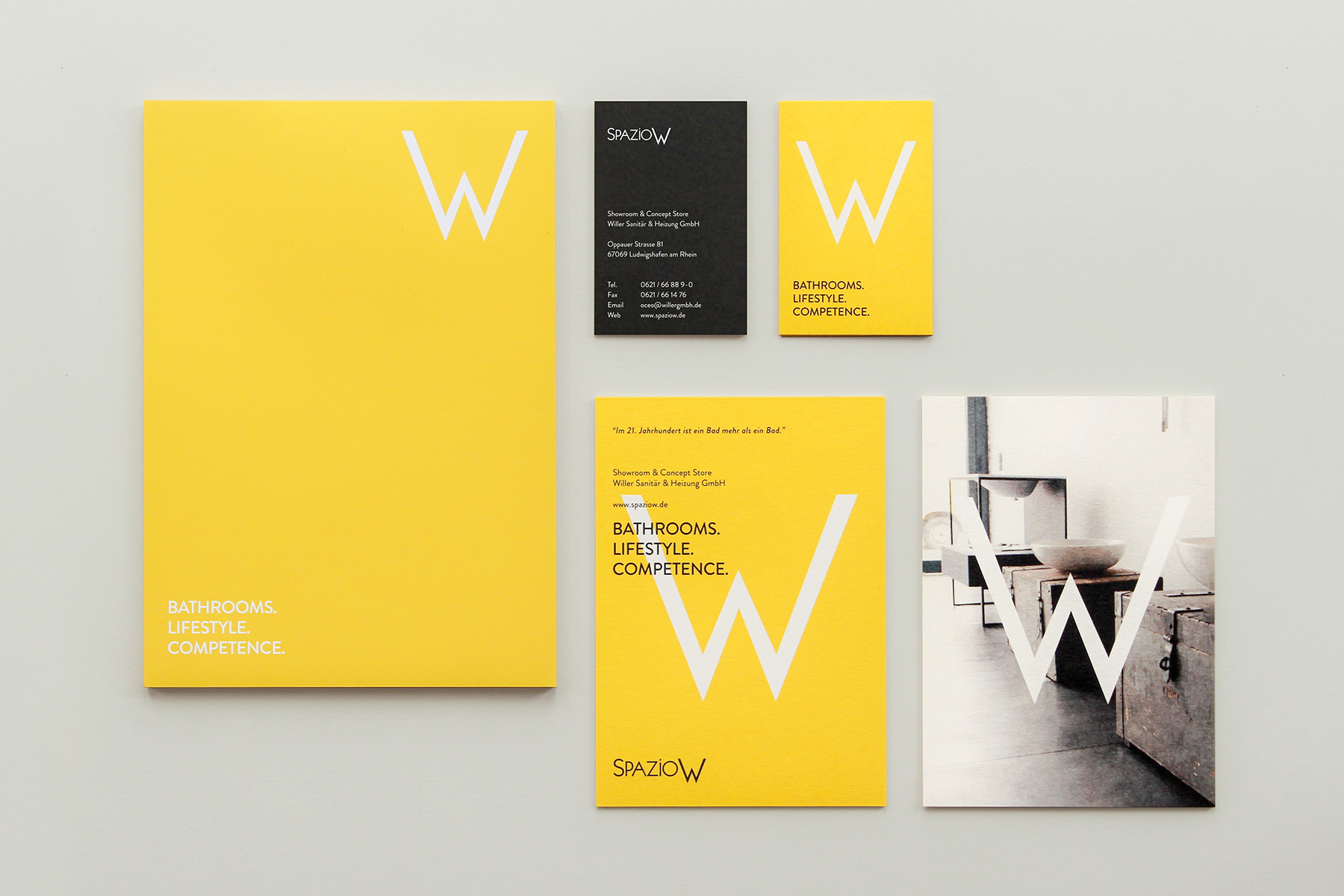
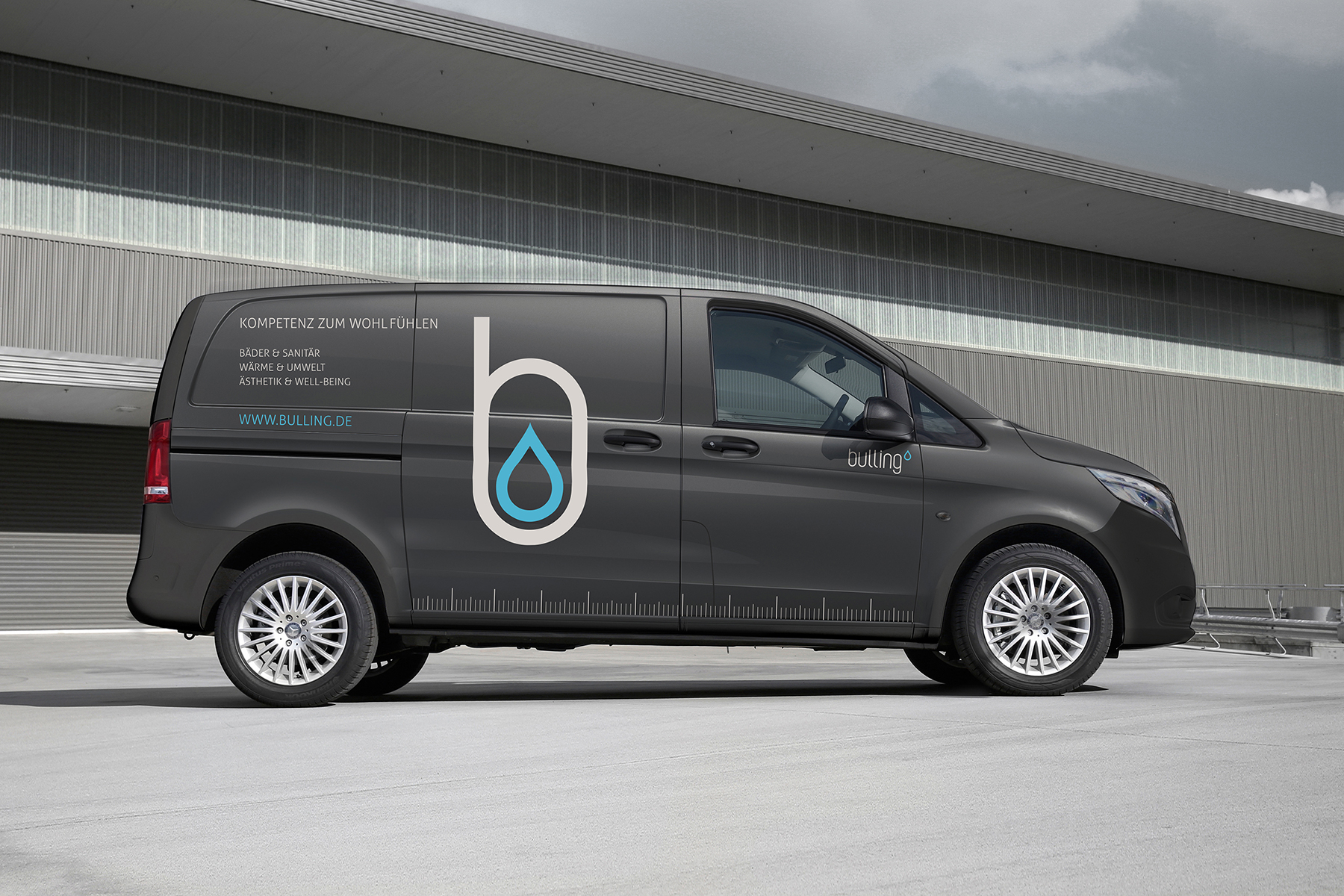
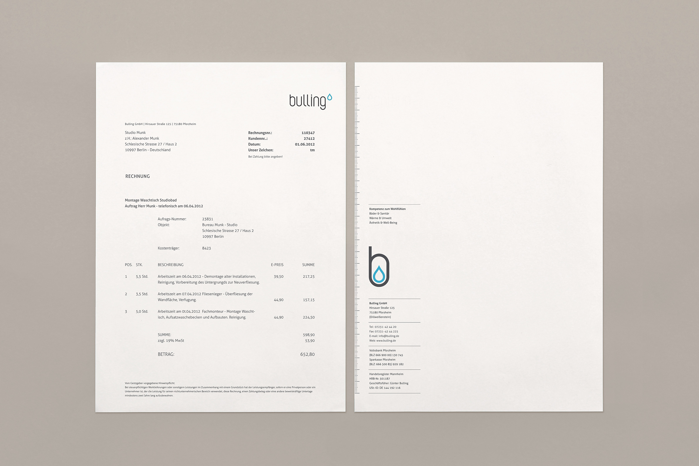
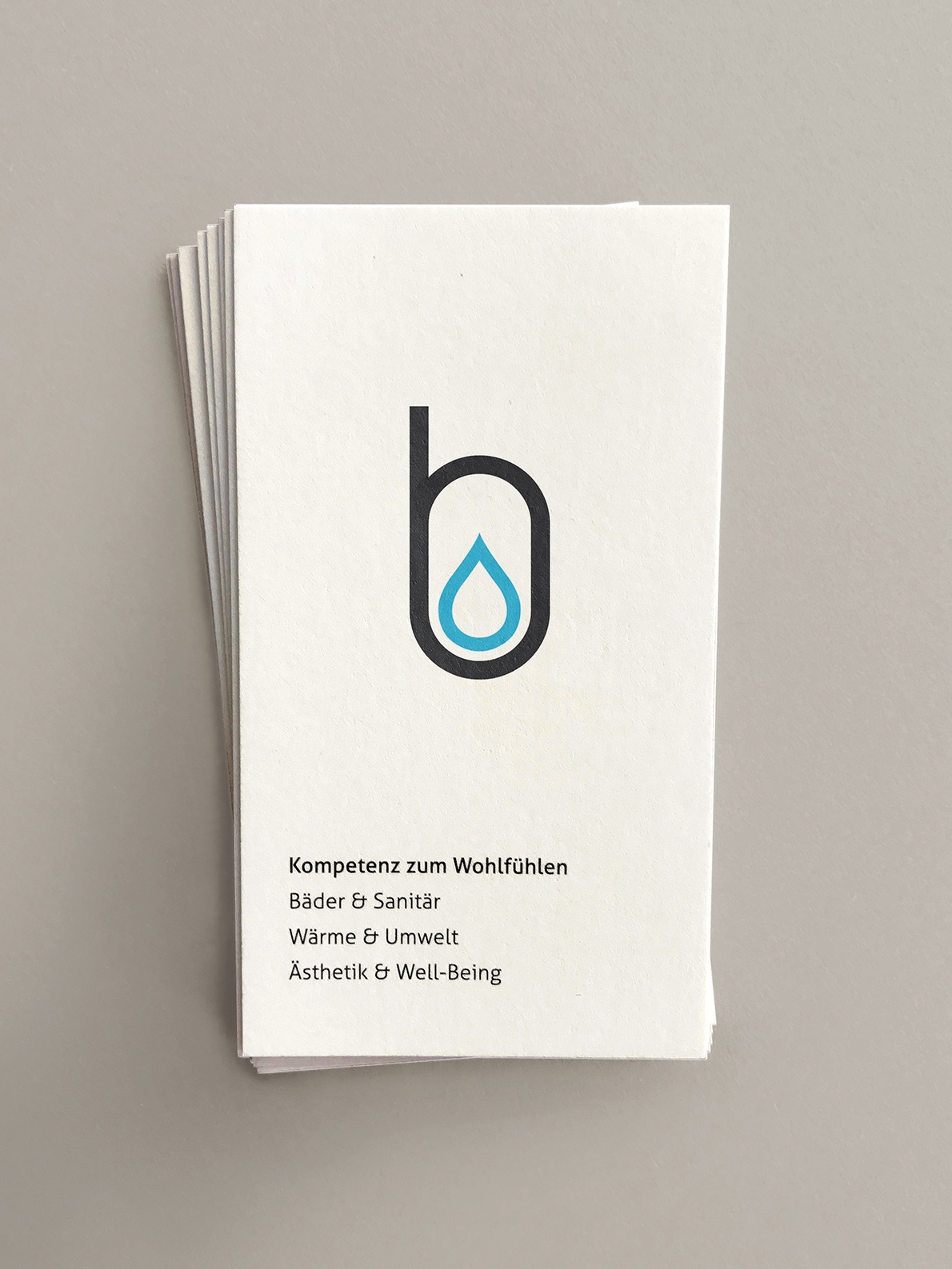
> Following our analysis of the as-is-situation, the perspectives and the field of competitors, we decided for a radical change of the company profile. Not without ensuring to retain the recall value the best way possible. We modernized the word mark and added a optional figurative mark emphasizing the striking soft first letter of the name and adding the shape of a water drop to visualize the field of activity in the simplest way.
> The color scheme gives the identity design a slight vintage look to communicate the company’s heritage and to ad a specific warmth, naturalness and personal accessibility. We renewed the entire visual world and sound of address towards a fresh „lifestyle bathroom“ appeal. Tasteful, sophisticated but not too luxurious.

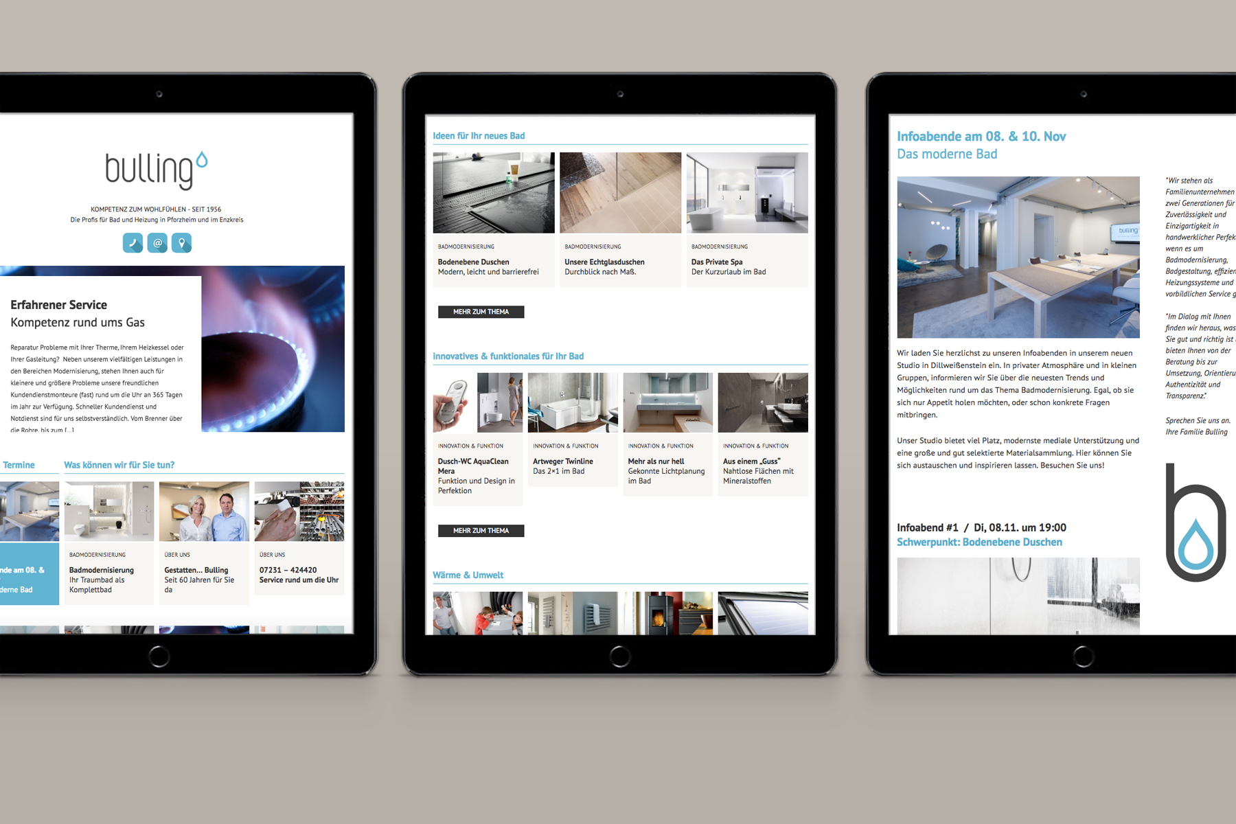




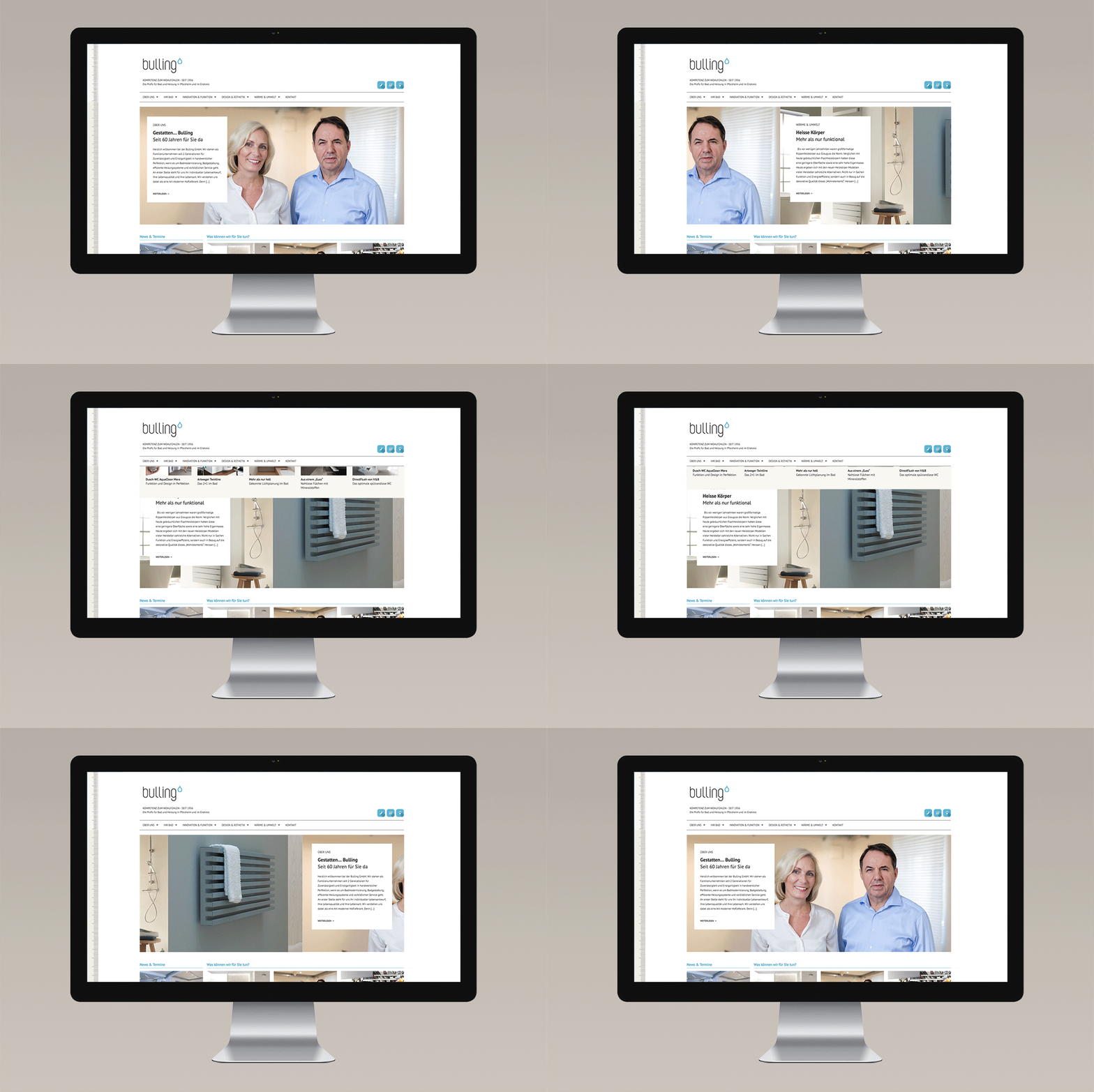
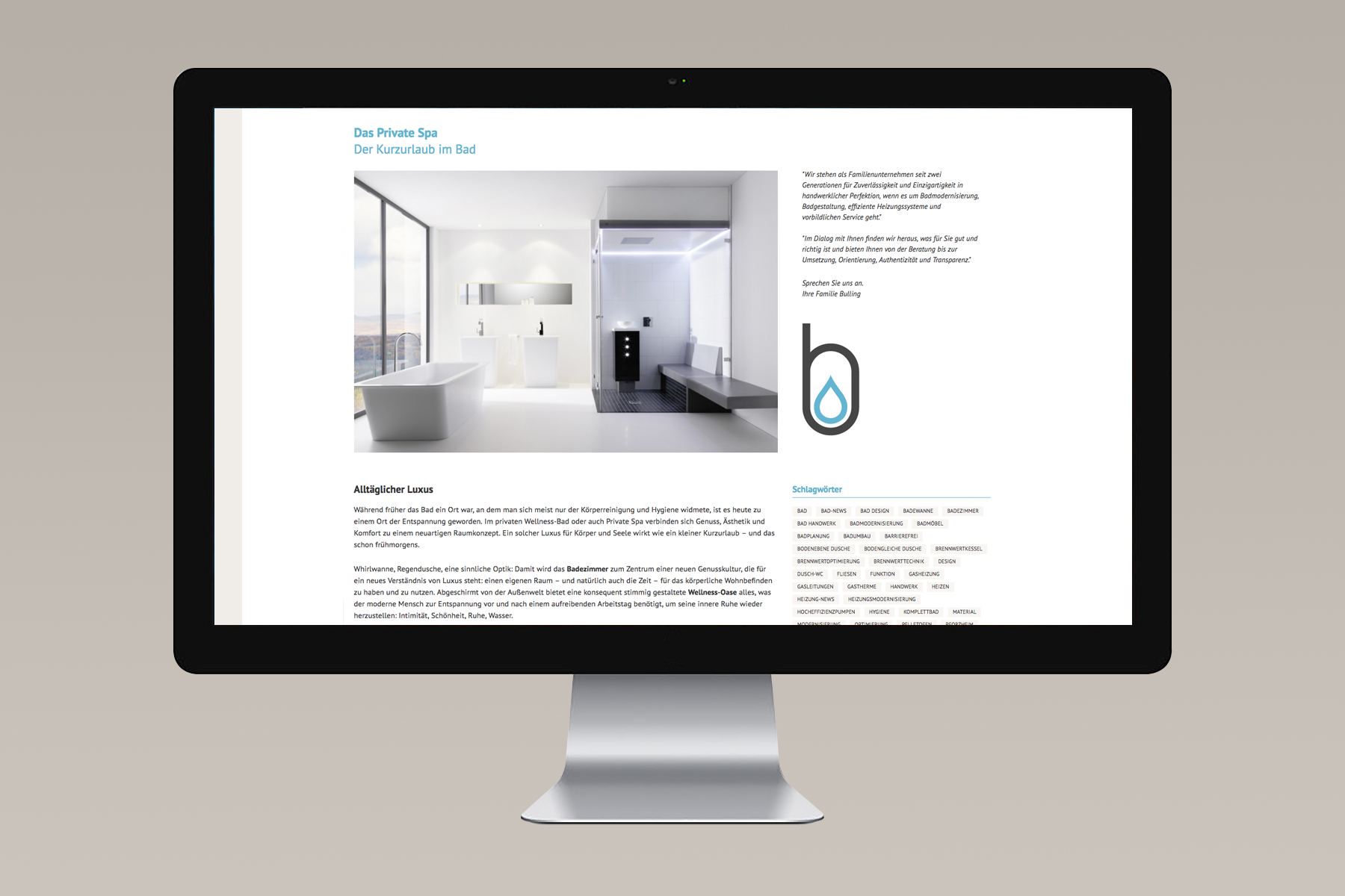

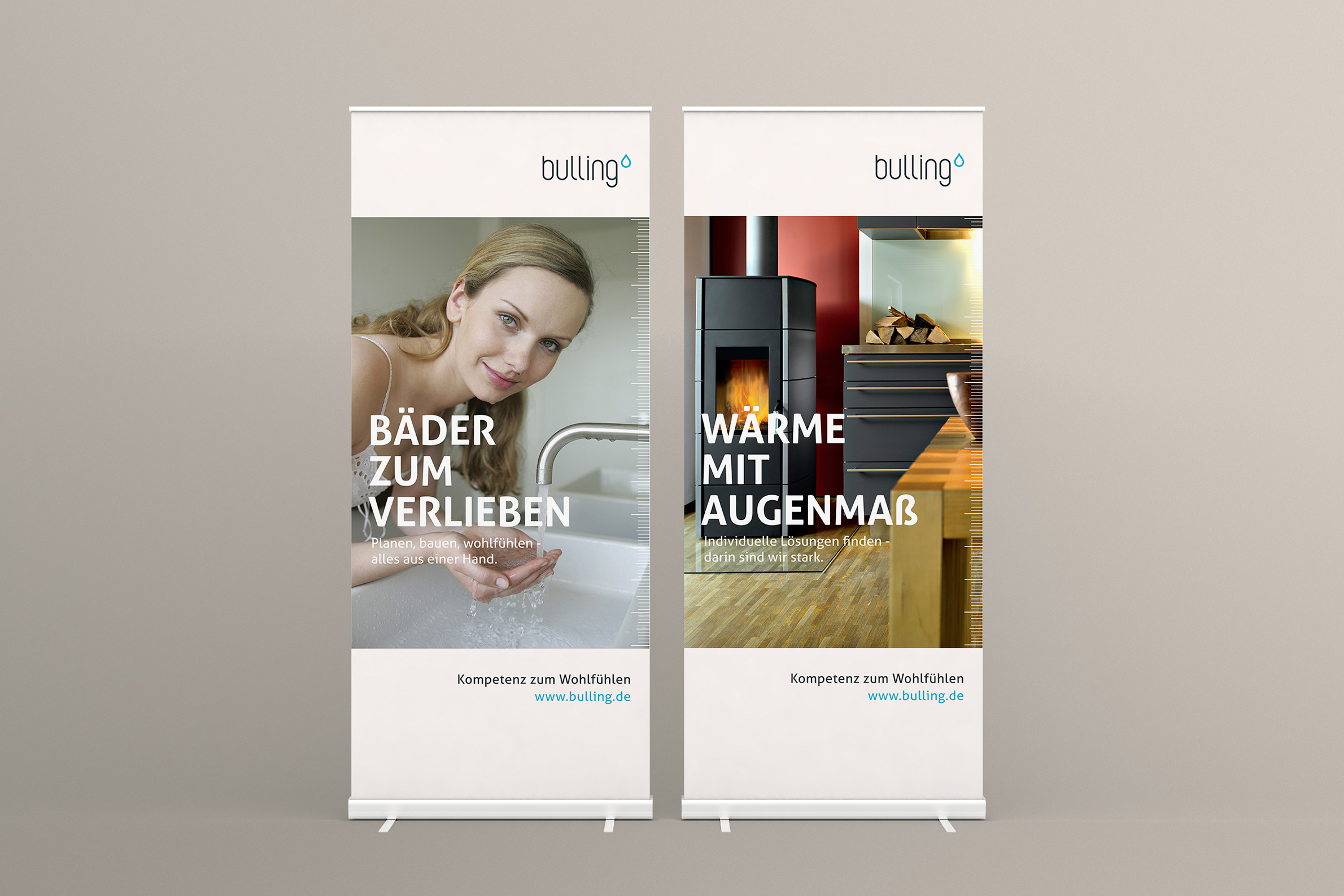


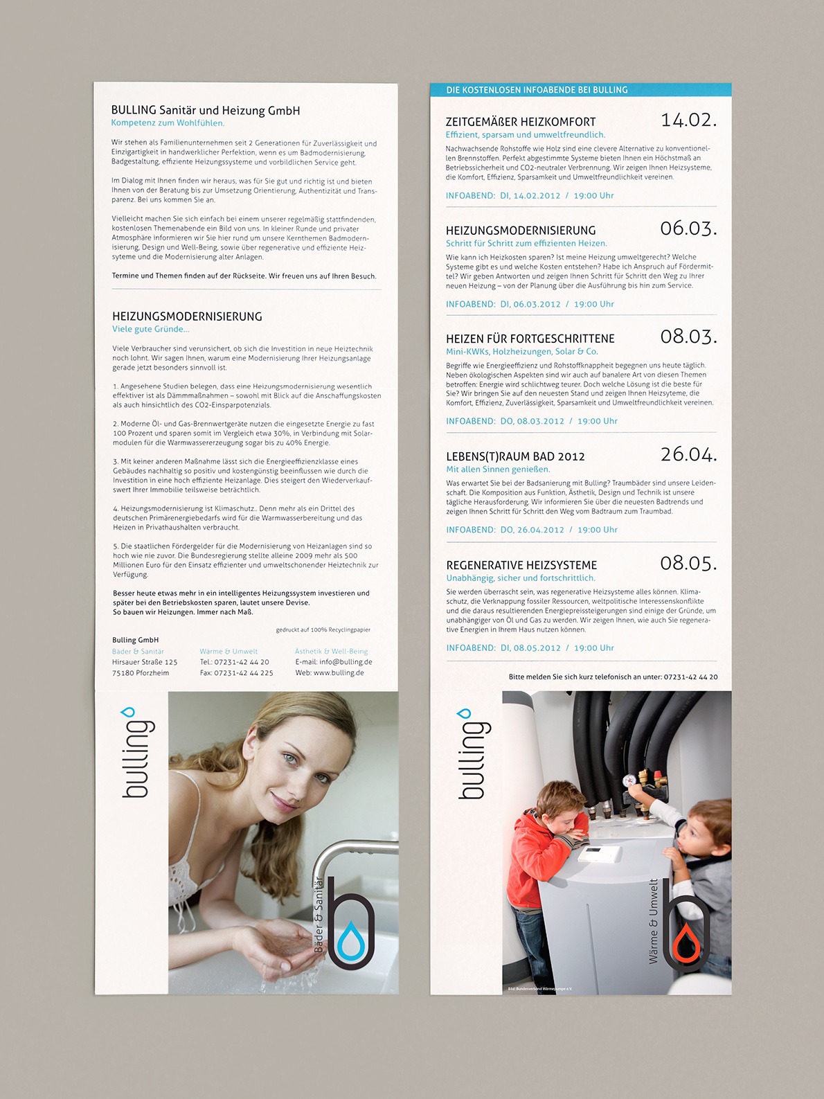

> We renewed the entire visual world and sound of address towards a fresh „lifestyle bathroom“ appeal. Tasteful, sophisticated but not too luxurious. The new website is highly informative to meet the target group where it usually kicks off in the search of information and support.
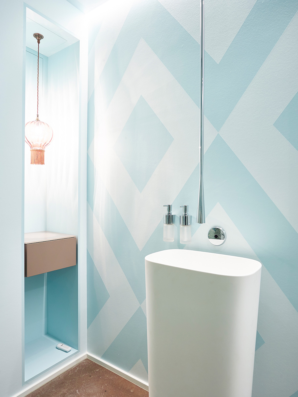
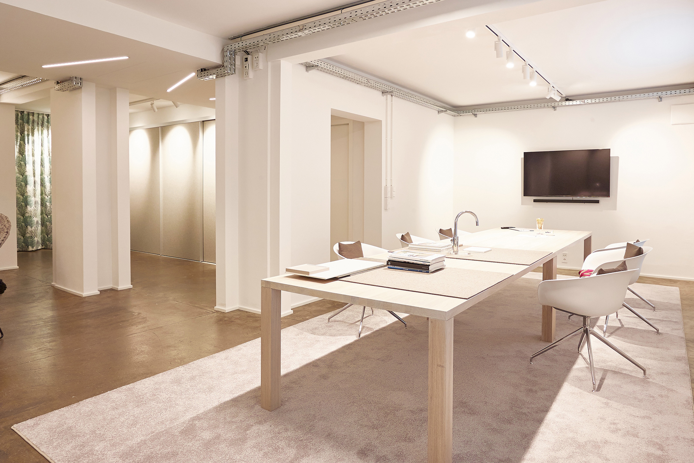
> The company’s premises have been modernized to really make prospective clients feel in good hands when it comes to the creation of well done spaces.
