
Client:
Laurus Property Partners,
Munich / London / Madrid
Services:
Brand design
Web design
Visual / Video
Sector:
Finance
Real estate
Consultancy
2022
The Look of Capital(s).
Re-branding for an International Real Estate Finance Boutique.
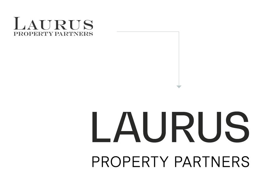
Laurus Property Partners specializes in financing real estate development projects and maintains offices in Munich, London, and Madrid. Before our revision, their visual appearance had a character of a traditional Munich law firm.
Our goal was to infuse the new brand image with stature, agility, and a global perspective - to shift from the elegant aesthetics of a noble fountain pen to the sleek, modern look of a digitally savvy company.
Client:
Laurus Property Partners
Services:
Brand design
Webdesign + development
Video
Sector:
Finance
Real estate
Consultancy
↑
WEB / homepage
↑
WEB / homepage
■ Brand design

↑
(1) RE-DESIGN OF THE WORD MARK
(2) KEY VISUAL
(3) CORPORATE TYPEFACE
(4) COLOUR SCHEME
↑
LOOK & FEEL / IMAGE STYLE
↑
WEB/ services
↑
WEB / services
↑
WEB / profile
The new logo embodies exactly this requirement. The closed block mediates stability, security and size, while the word mark stays light and agile. The prominent “A” radiates digitality and posesses simultaneously a strong architectural character, while the “R” gives personality and ties it with the old word mark. The key visual conveys spatial depth and a holistic, process-oriented approach.
The color scheme, inspired by the architecture, flows seamlessly from cool, factual tones to warm, natural hues, exuding modern elegance. The imagery stays calm 'tone on tone'. The Hero-video on the starting page highlights internationality and the theme, real estate.
↑
OFFICE EQUIPMENT / PRINT
Further projects.
Büro Munk develops distinctive brand identities and shapes visual communication for companies and organisations. From strategic foundations to digital and printed applications.
Büro Munk develops distinctive brand identities and shapes visual communication for companies and organisations. From strategic foundations to digital and printed applications.
Services
Brand Design
Corporate Design
Strategy & Ideation
Graphic Design
Visual Communication
Contact
Blücherstrasse 15
10961 Berlin - Kreuzberg
Germany
→ Email
Jobs
We currently have no open positions or internship opportunities.
Follow Us