
Kunde:
Quartier Am Humboldthain GmbH,
Berlin
Leistungen:
Strategie
Brand Design
Webdesign
Grafikdesign
Sektor:
Real Estate
Public Relation
Architektur
2021 -
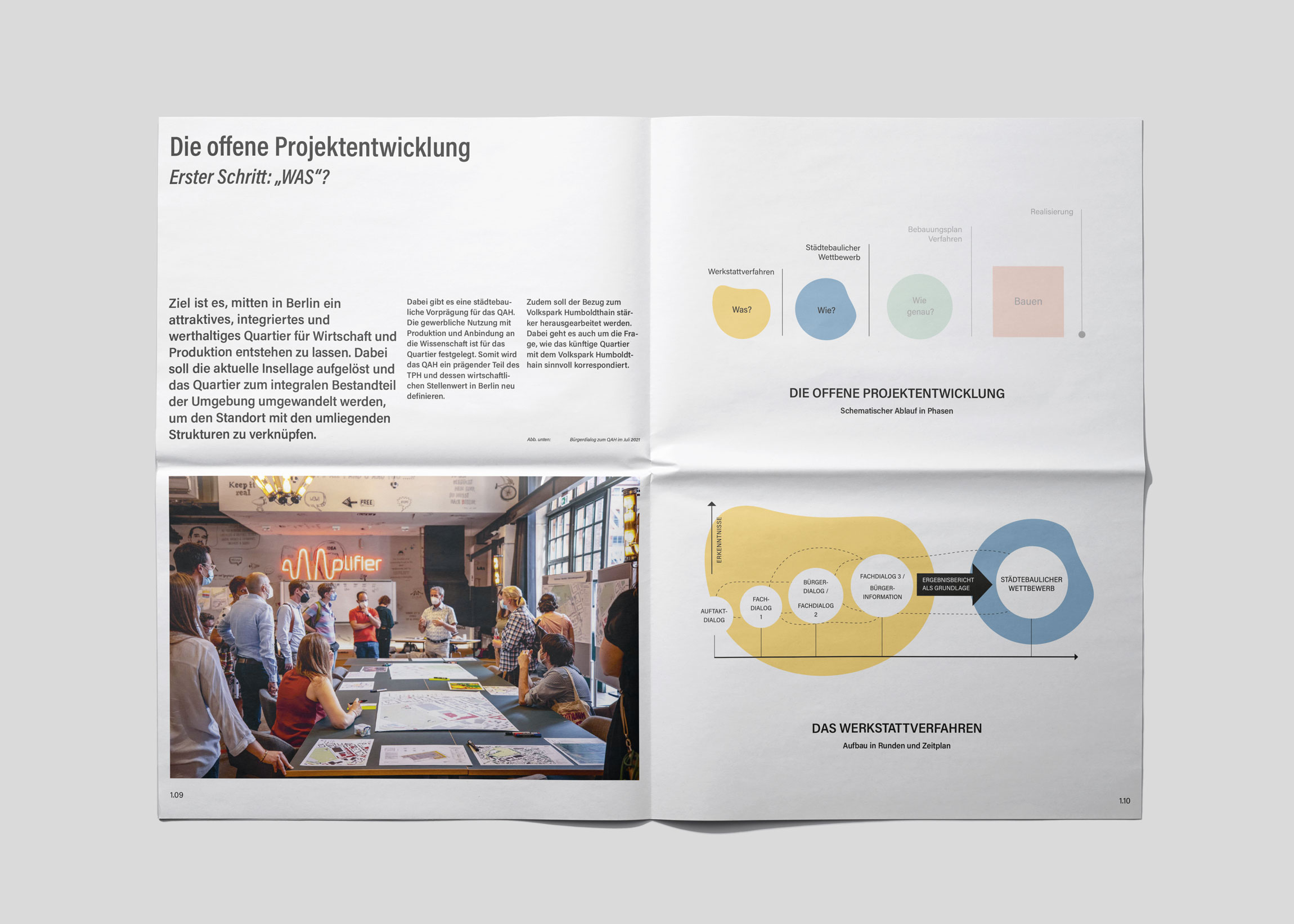
Die Persönlichkeit eines Prozesses.
Branding und visuelle Kommunikation für eine Quartiersentwicklung in Berlin.
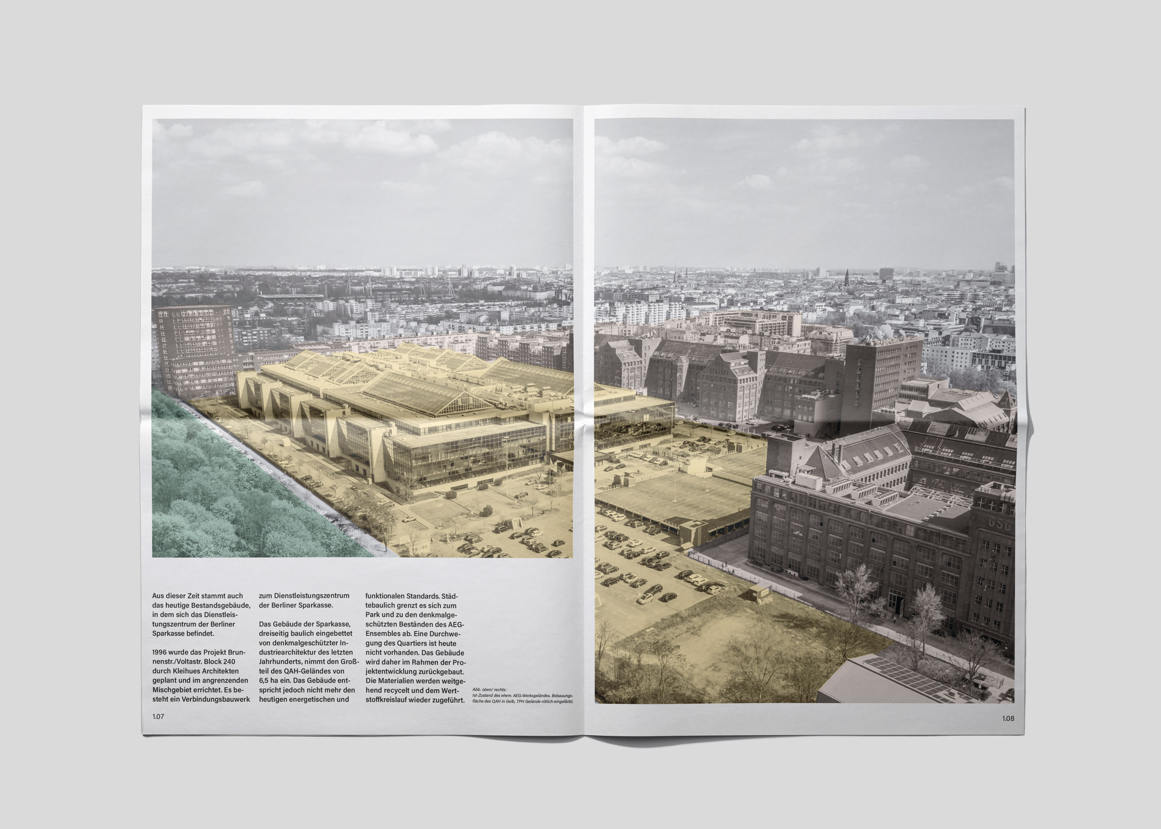
Im Gegensatz zu klassischen Real-Estate-Brandings, die sich primär an Käufer oder Mieter richten, ging es beim QAH in Berlin-Mitte darum, einem offenen Entwicklungsprozess eines gesamten Stadtquartiers ein sympathisches Gesicht zu geben.
Anwohner, Gewerbetreibende und Politik sollten nicht einem abgeschlossenen Investorenprojekt gegenüberstehen, sondern einem transparenten Prozess im öffentlichen Interesse – mit sozialer und ökologischer Verantwortung.
Kunde:
Quartier Am Humboldthain GmbH
Leistungen:
Strategie
Brand Design
Webdesign
Grafikdesign
Sektor:
Real Estate
Public Relation
Architektur

↑
HANDOUT / Projektdokumentation
↑
VISUALS / Projektvorstellung
↑
WEB / Homepage
↑
WEB / Location
↑
WEB / Prozess
Zurückhaltend und sachlich – und dennoch mit Haltung. Die Wortmarke wirkt bewusst prozesshaft und funktional, fast wie ein Arbeitstitel. Eng gesetzte, hohe Lettern verleihen ihr zugleich eine städtisch-architektonische Anmutung – vielschichtig wie ein Kiez.
Das Key Visual übersetzt diese Idee in eine Formensprache, die sich von amorphen Elementen hin zum klaren Quadrat entwickelt – von der Idee zum gebauten Raum. Ein zurückgenommenes Farbsystem in abgetönten Grundtönen unterstreicht den dialogorientierten, seriösen Charakter des Auftritts.
↓
HANDOUT COVER VORNE / Phase 1 - Offene Projektentwicklung
↑
HANDOUT COVER VORNE / Phase 2 - Städtebaulicher Wettbewerb
↑
WEB / Homepage Hero Slider
↑
(1+3) EVENT SIGNAGE
(2) BRANDED QR
Weitere Projekte.
Büro Munk, Berlin
Angetrieben von strategischem Denken und gestalterischem Instinkt entwickelt Büro Munk prägnante Markenidentitäten und gestaltet visuelle Kommunikation für Unternehmen und Organisationen. Von der strategischen Grundlage bis zur digitalen und gedruckten Umsetzung.
Büro Munk, Berlin
Angetrieben von strategischem Denken und gestalterischem Instinkt entwickelt Büro Munk entwickelt prägnante Markenidentitäten und gestaltet visuelle Kommunikation für Unternehmen und Organisationen. Von der strategischen Grundlage bis zur digitalen und gedruckten Umsetzung.
Services
Brand Design
Corporate Design
Strategie & Konzept
Grafikdesign
Visuelle Kommunikation
Kontakt
Blücherstrasse 15
10961 Berlin
Germany
→ Email
Jobs
Wir haben derzeit keine offenen Stellen oder Praktikumsplätze.
Follow Us