


Kunde / Client:
Minga Berlin Apparel GmbH
Berlin
Jahr / Year:
2012
Bereiche / Fields of activity:
Branding
Pattern & Color Design
Print Design
Screendesign - UI/UX
Packaging
PR / Copywriting

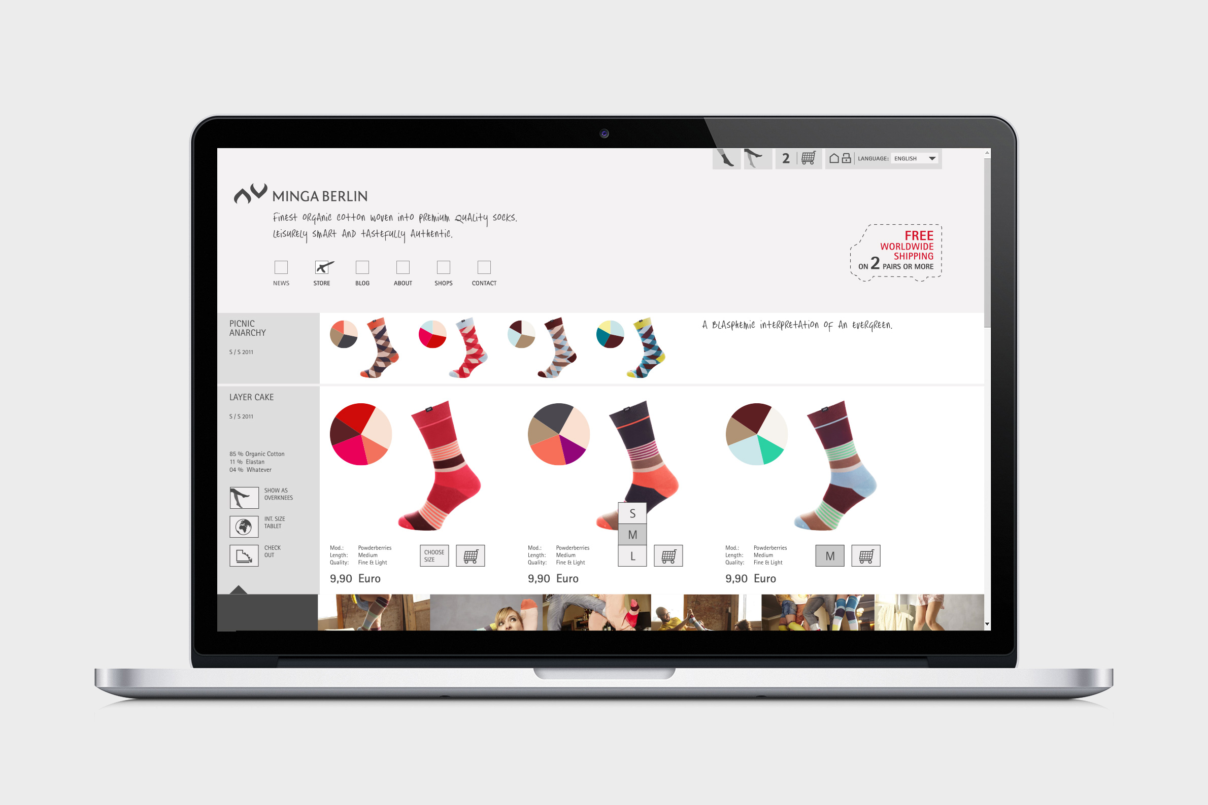
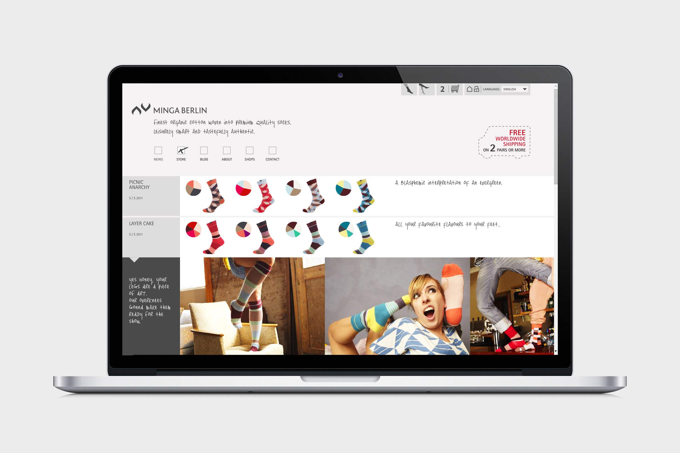
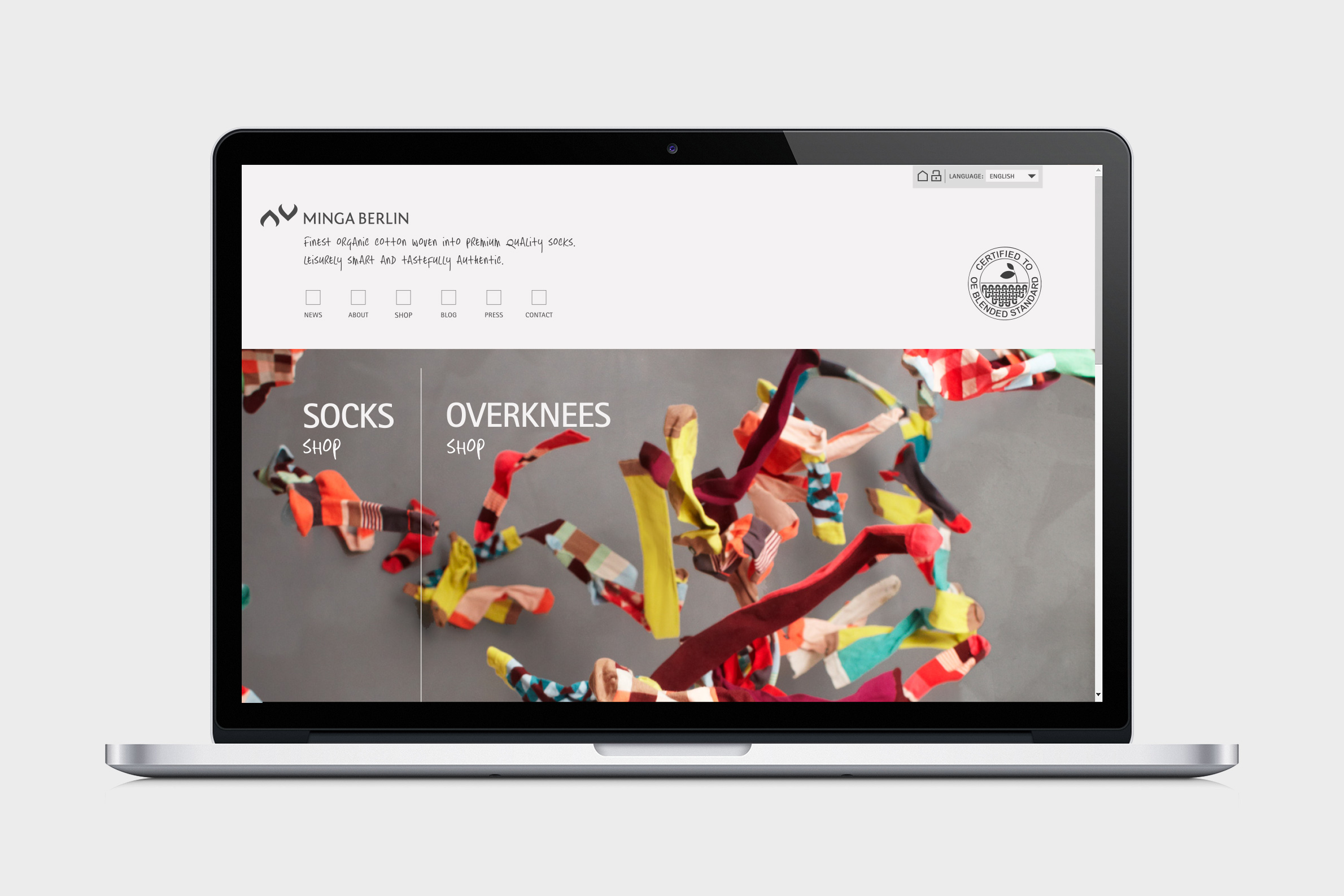
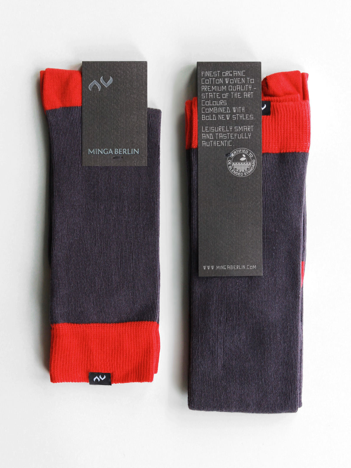
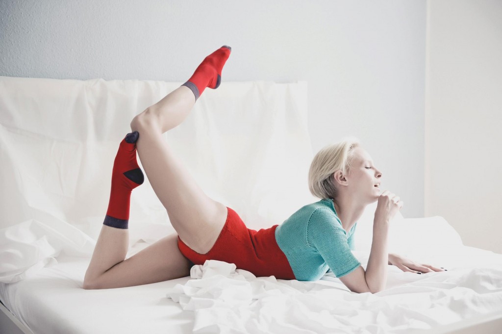
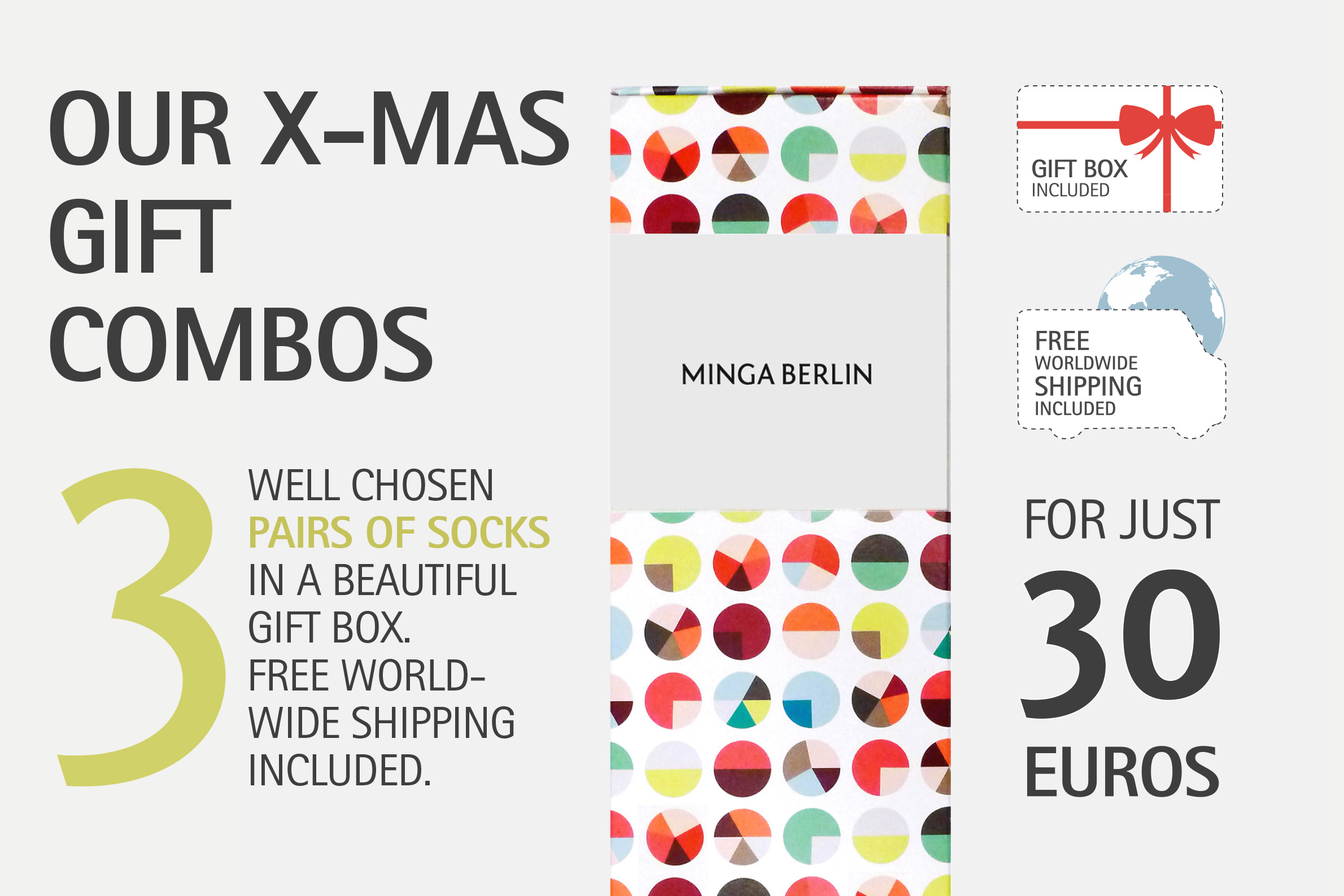
> The branding and identity design for Minga Berlin has been the kind of project we live for. We had our hands on every item and thus were able to create a truly consistent brand identity. Moreover, the client shared our belief in environmentally and socially sustainable production processes in the fashion industry. The raw idea was - to put it simply - to produce colorful socks. There weren't many on the market that time apart from the big players. We did our due diligence and put our heads together to developed the concept of the brand and find the right niche. We wanted to make it a real apparel label, to create fashion accessories that can make the difference in an outfit. And we set ourselves high standards for quality, material, sustainability and style.

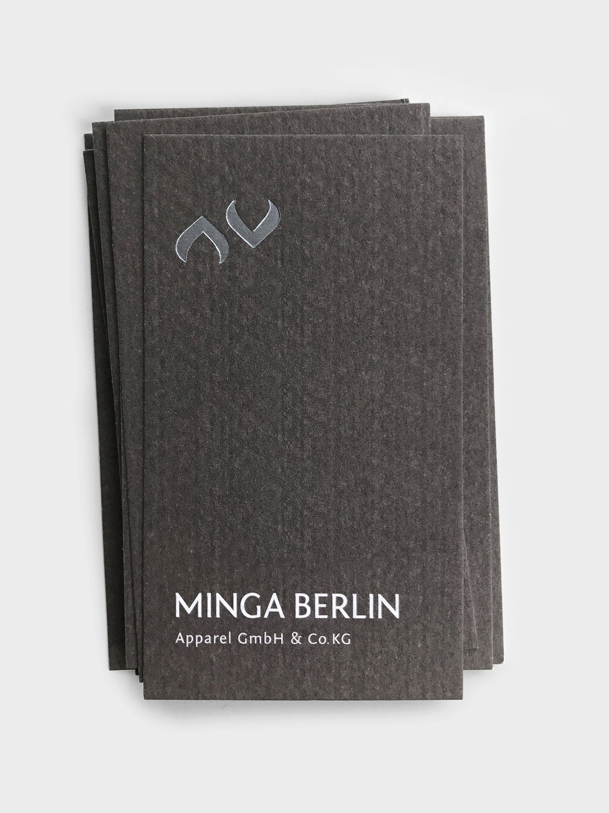

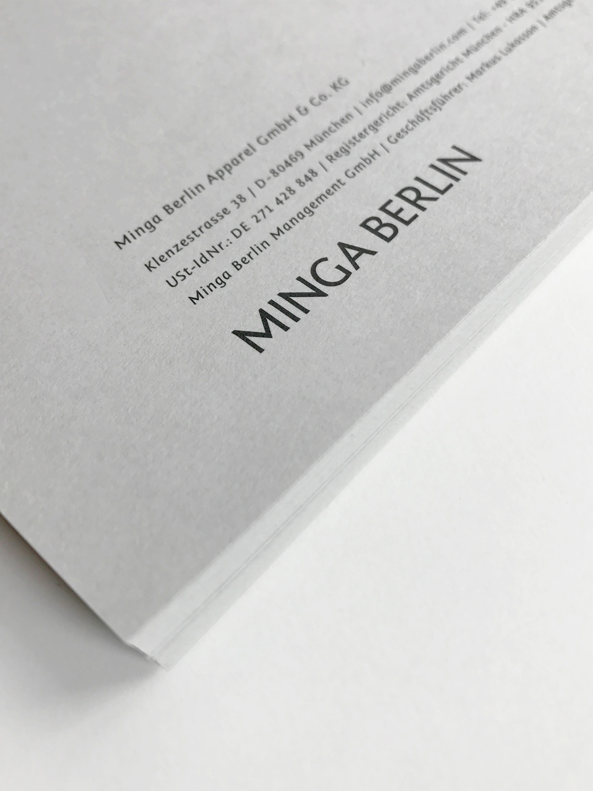

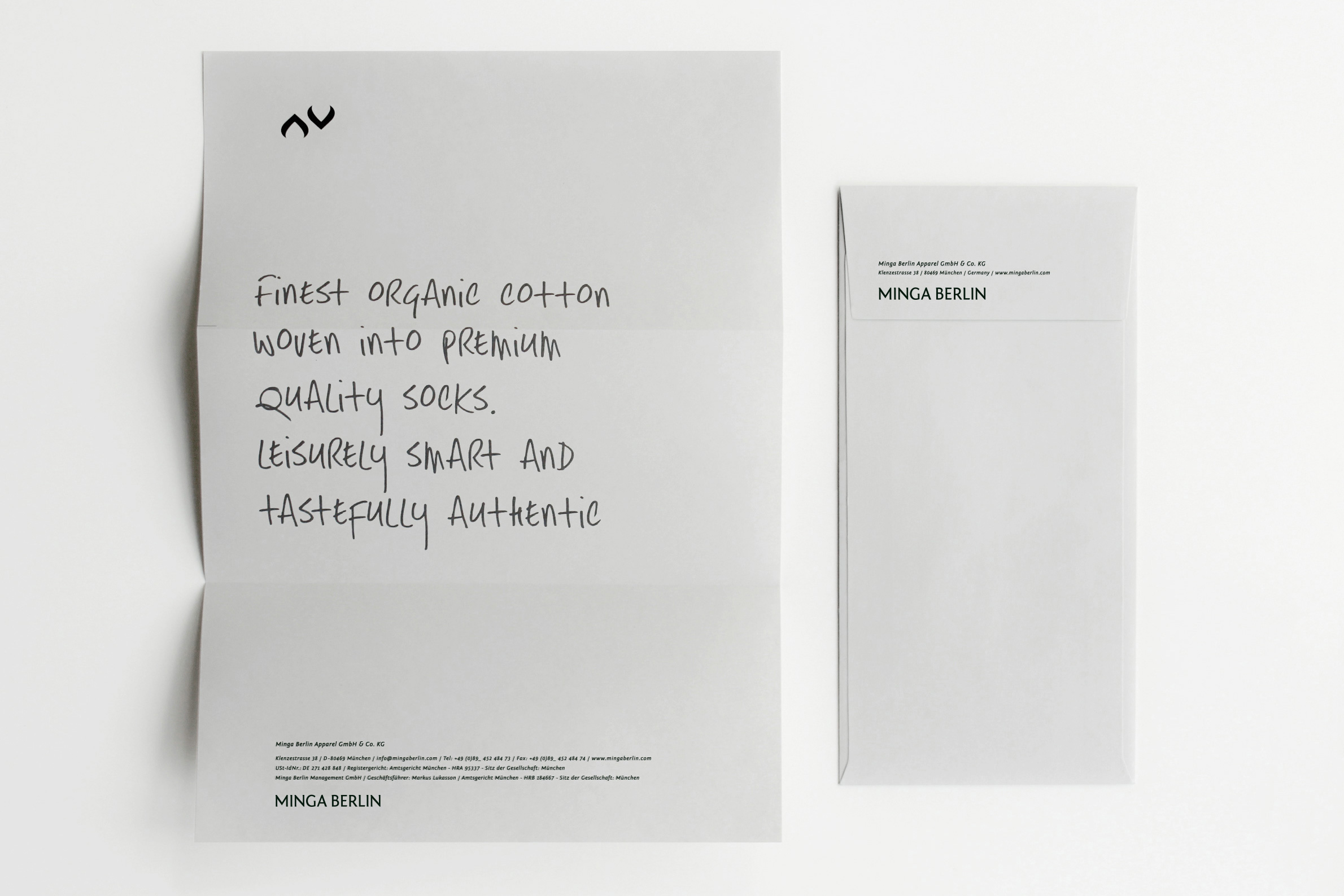

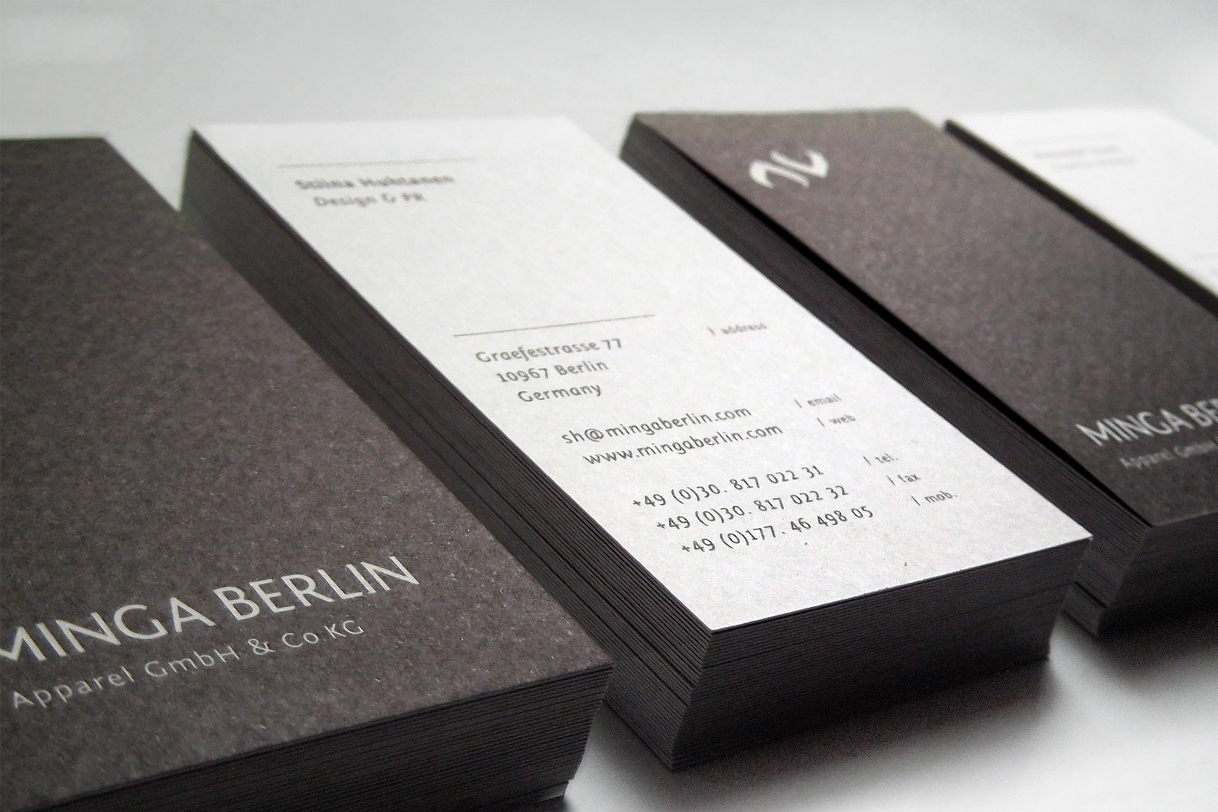
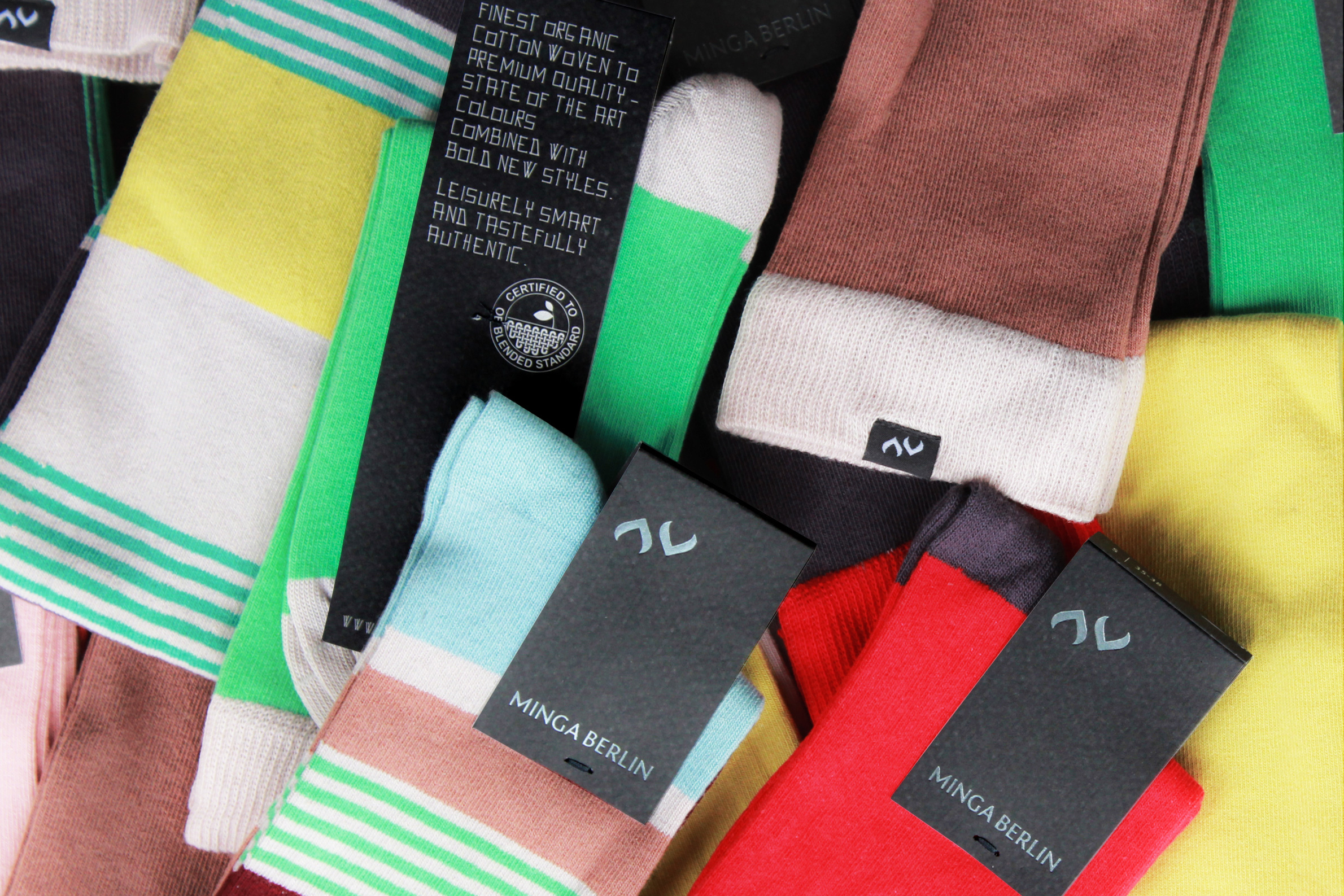

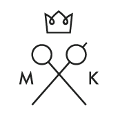
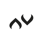
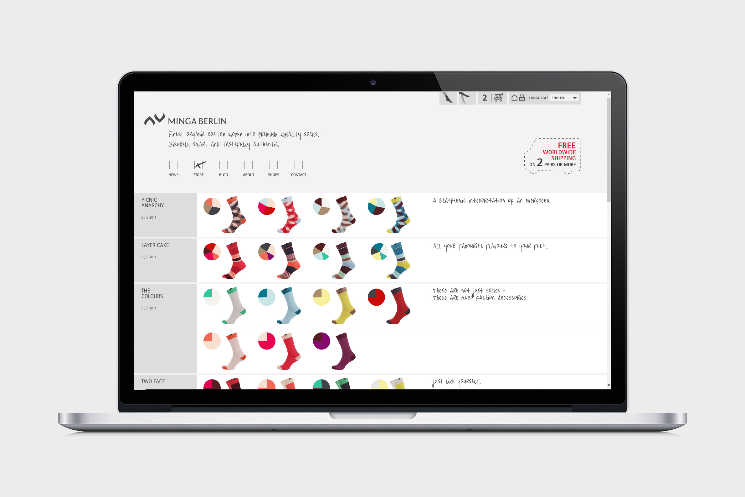
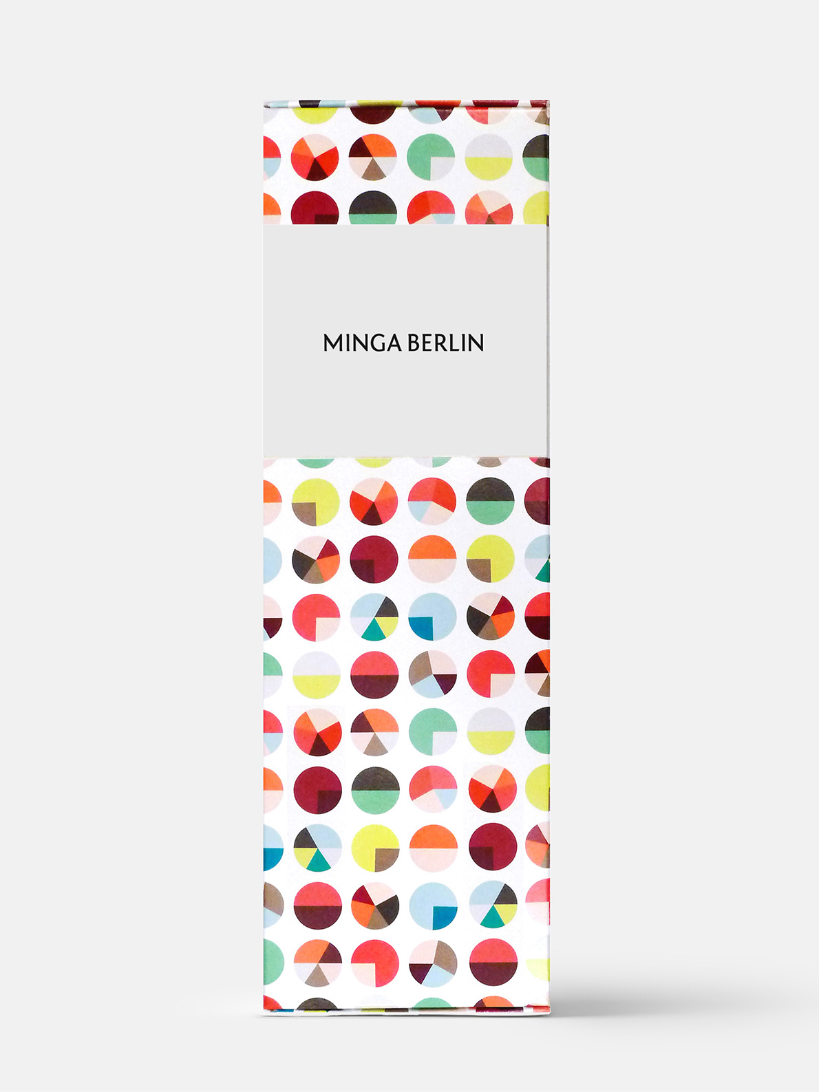
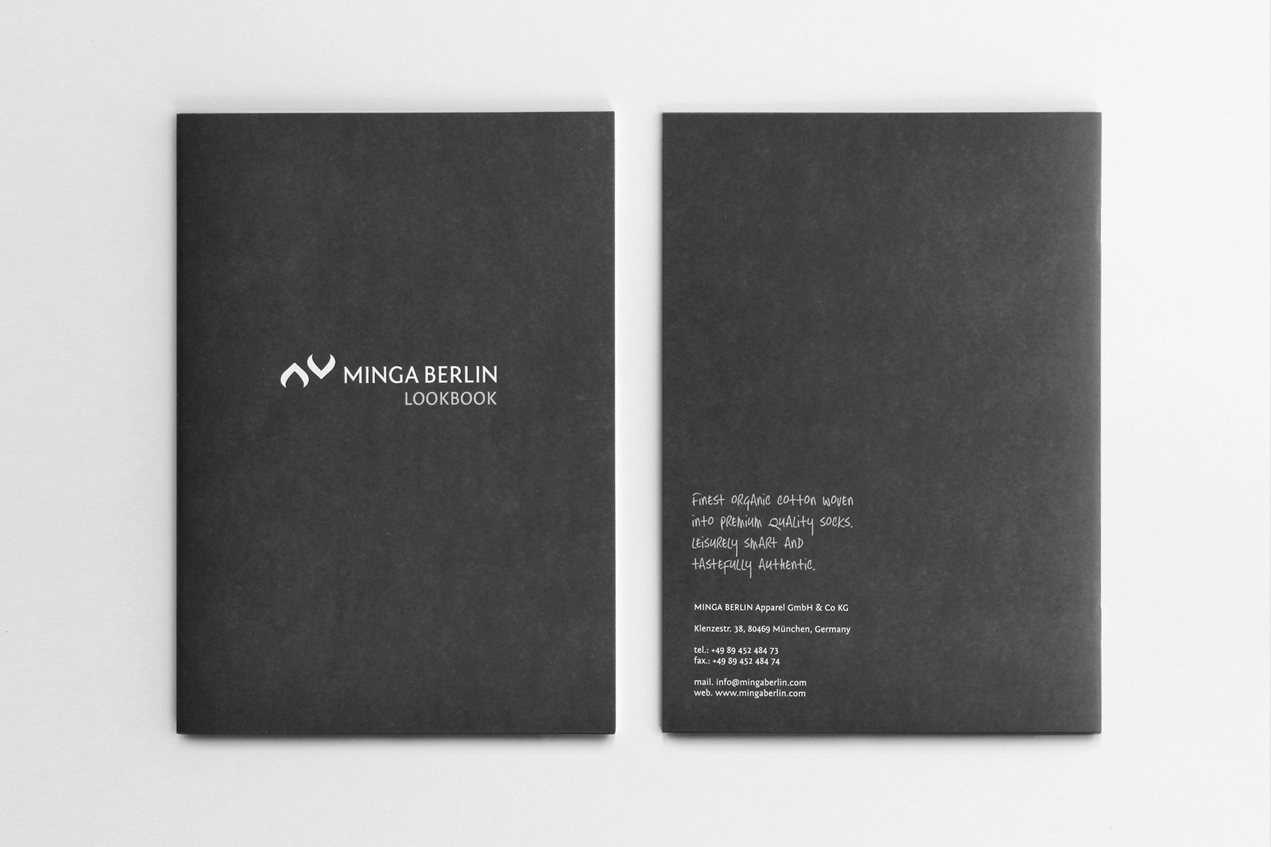
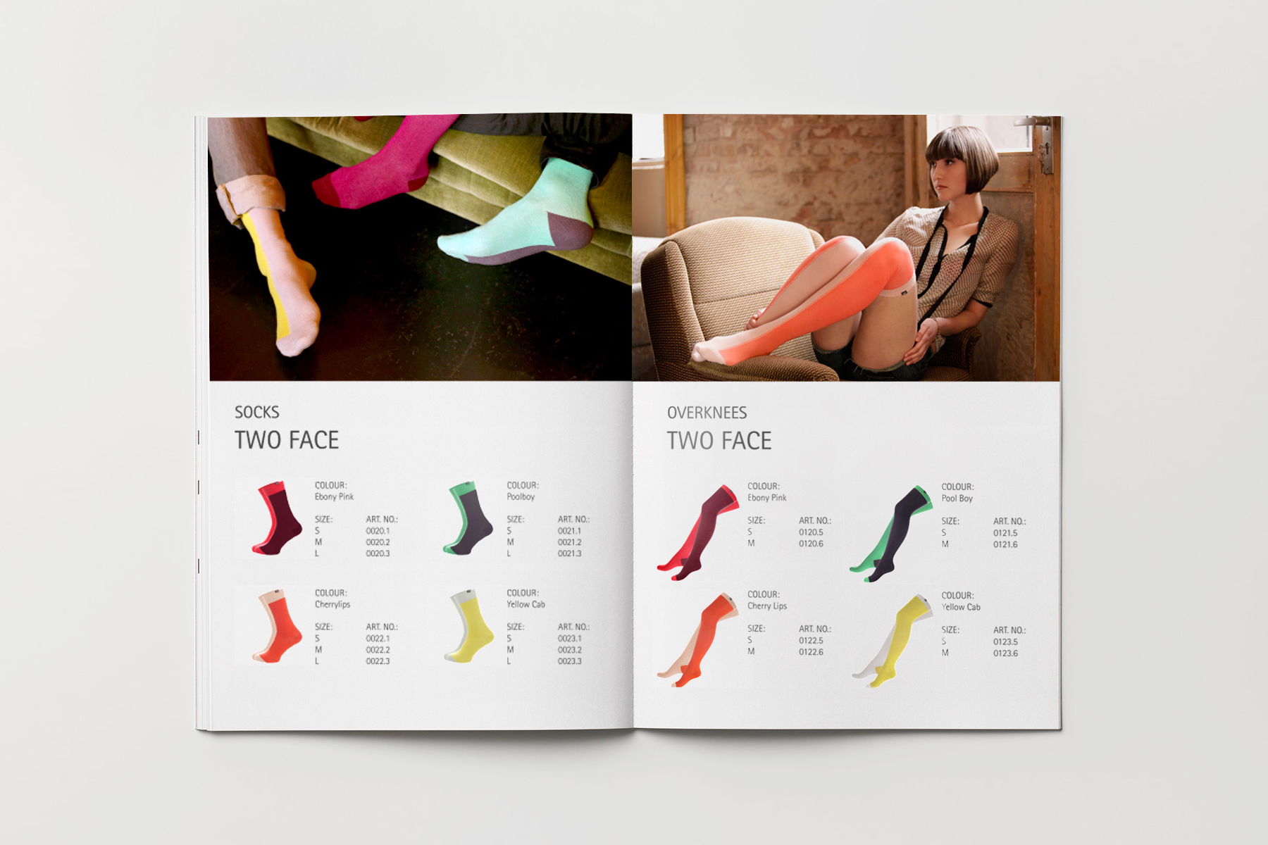
> First, we came up with the name. The client was based in Munich (in Bavarian dialect: Minga) but the brand and the style was developing in Berlin. A good contrast, a good mixture, a good name: Minga Berlin. Next, we developed the collection inspired by the latest fashion color trends and striking geometric designs. We settled the look and feel somewhere between high fashion and street style to target multiple groups of buyers. Dark and light gray and silver foil embossing make a fashionable and serious look and a great background for the bright colors of the products. This concept of contrast forms the basis of the branding and the identity design. The picture mark represents the unisex idea of the brand (the symbols for masculinity and femininity) and transports a specific apparel brand attitude. The contrasting mixture of fonts again brings together high and street fashion, Minga and Berlin.


Similar projects >>


INDEX

We are an award winning interdisciplinary design studio and creative consultancy based in Berlin. Driven by aspiration and instinct. We create state of the art identity design and implement it into analog and digital communication, into products and spaces.
We help to channel ideas, to picture future, to define values, audiences and styles. We create atmospheres, illustrate information, find the right words and nail it. We are YOUR CREATIVE TOOL.
Check us out on:
/ Instagram / Tumblr / Pinterest
© 2017 by Büro Munk
/ Imprint / Privacy Policy
Büro Munk
Blücherstrasse 15
10961 Berlin, Germany
info@bueromunk.de
/ Identity Design
/ Web + Print Design
/ Art Direction
/ Creative Consultancy
You would like to work with us, discuss your project or just say hi?
Get in contact via EMAIL.